Cartier (typeface)
 | |
| Category | Serif |
|---|---|
| Classification | Old Style |
| Designer(s) | Carl Dair Rod McDonald (digital redesign) |
| Foundry | Mono Lino Monotype |
| Variations | Raleigh Cartier Book |
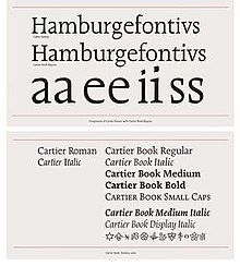
Cartier is a family of serif old style typefaces designed in 1967 by Carl Dair, who was commissioned by the Governor General of Canada-in-Council to create a new and distinctively Canadian typeface. The typeface was named for the explorer Jacques Cartier and dedicated to the Canadian people.[1] The first proof of Cartier (in Roman and Italic faces) was published as "the first Canadian type for text composition" to mark the centenary of Canadian Confederation.[2] The typeface was used to set the Canadian Charter of Rights and Freedoms[1].
In 1977 a revival of Cartier was produced under the name Raleigh by Robert Norton.
This typeface was later redesigned by Canadian typographer Rod McDonald in a digital format. McDonald's Cartier family removed inconsistencies in the baseline weight, and streamlined the stroke angles to enforce a strong horizontal flow.[3] His work was a form of homage to the validity of Dair's original design, which was incomplete and plagued with weight, stroke, and grid issues because Dair insisted that the type foundry not refine the face.[4]
References
[edit]- ^ a b Writer, Katie Daubs Feature (2015-09-27). "The man who gave Canada its own typeface finally gets his due". Toronto Star. Retrieved 2024-10-29.
- ^ The Canadian Encyclopedia Archived July 16, 2010, at the Wayback Machine
- ^ Allan Haley, "Rod McDonald, Canada's Typographer Laureate", Step Inside Design (January/February 2006).
- ^ Sara Curtis, "Rod McDonald and Carl Dair", Applied Arts (November/December 1999). Retrieved August 25, 2013.


 French
 Deutsch